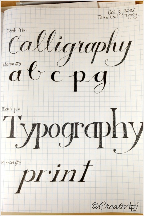
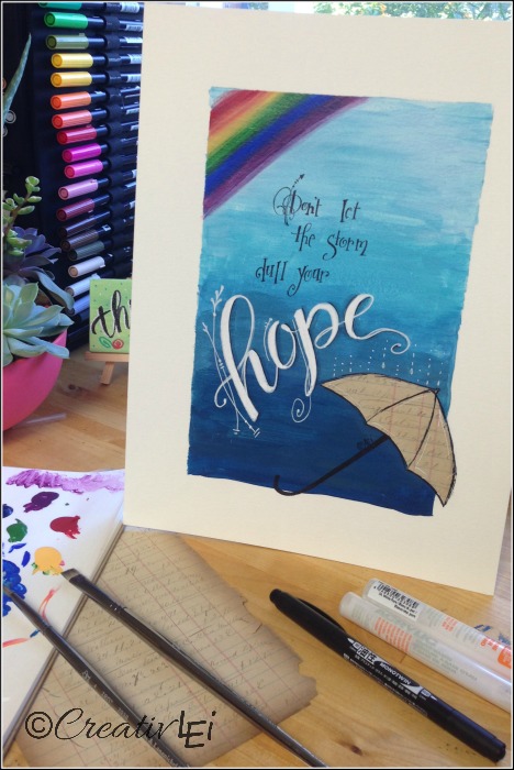
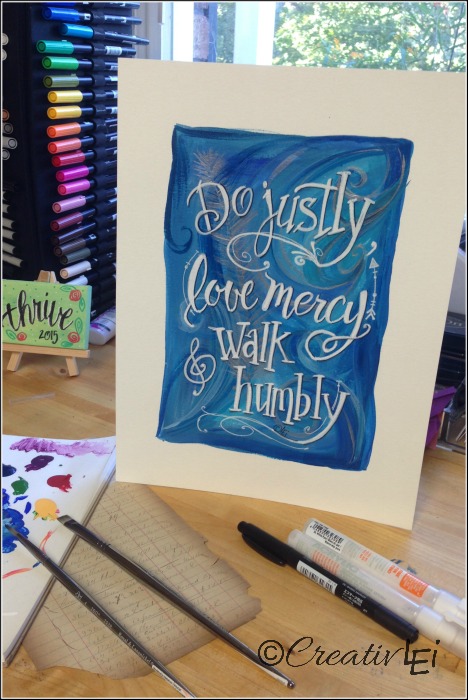
Today we’re building on yesterday’s assignment. Adding color is an easy way to kick up the pretty in your creative lettering.
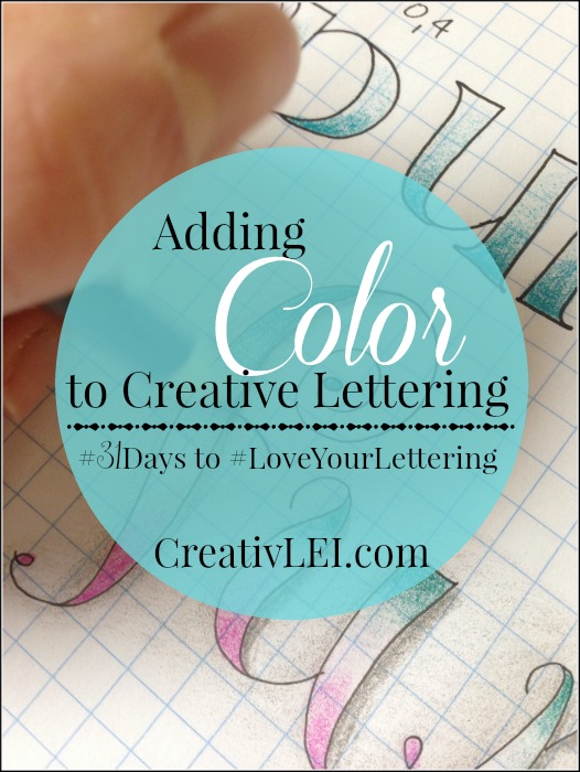
For this assignment I recommend starting with a soft pencil, so that you can easily erase your sketching lines. Remember, I am working big so that I can photograph it for you, work at a size that is comfortable to get the details, but not so big that you’re over-working your hands.
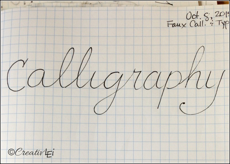
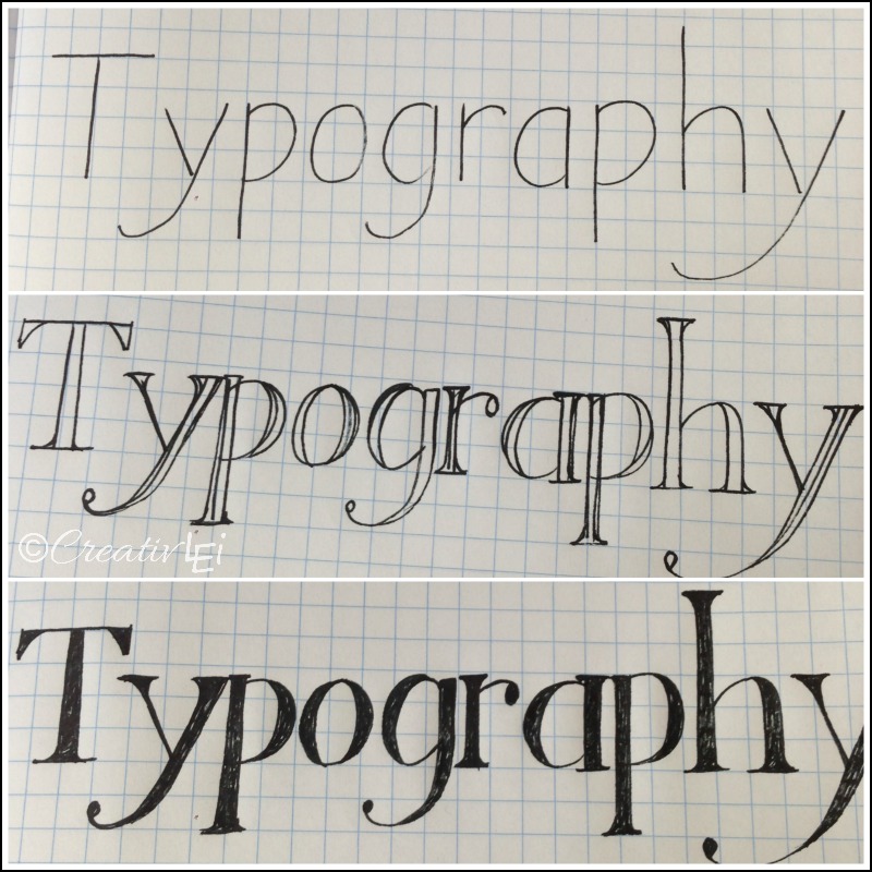
Draw out your word in cursive or print. Don’t press hard… We’ll get to techniques using pressure later this month. You’re just lightly sketching your word for spacing and layout.
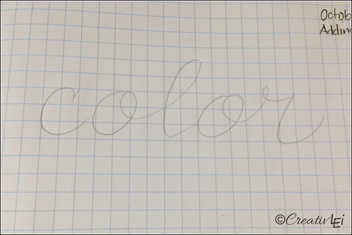
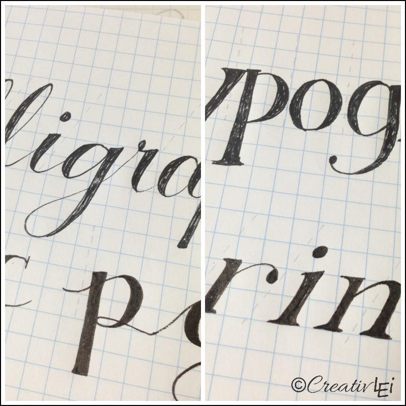
Add in the weighted lines. Keep these lines light, too. I weight the vertical lines (stems, ascenders, descenders). Remember that you don’t want two thick lines crossing, the contrast of the thick/thin is what makes creative lettering eye-pleasing.
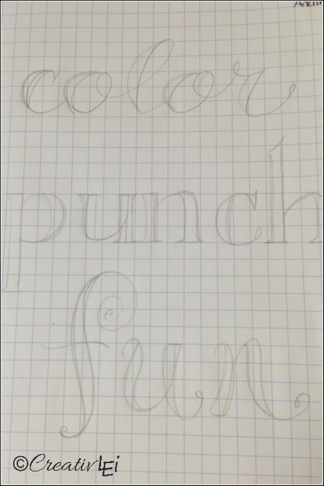
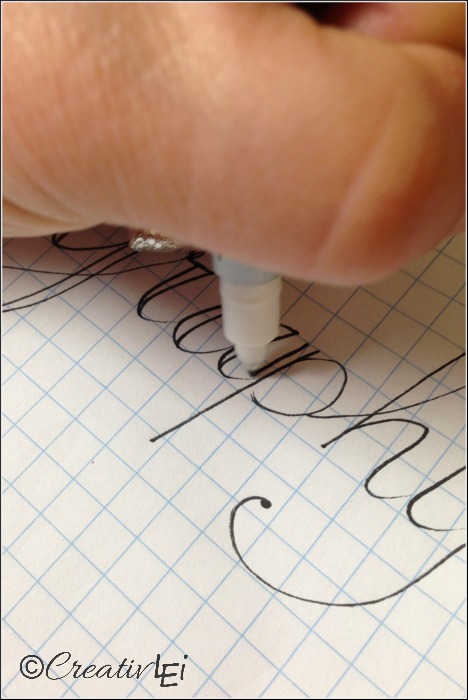
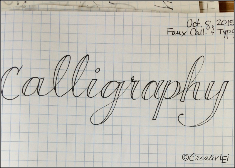
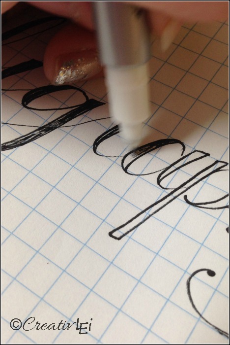
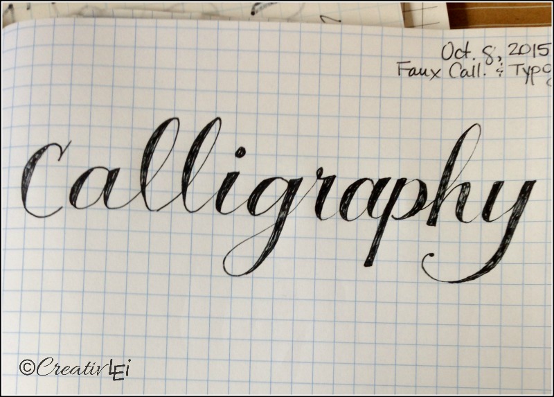
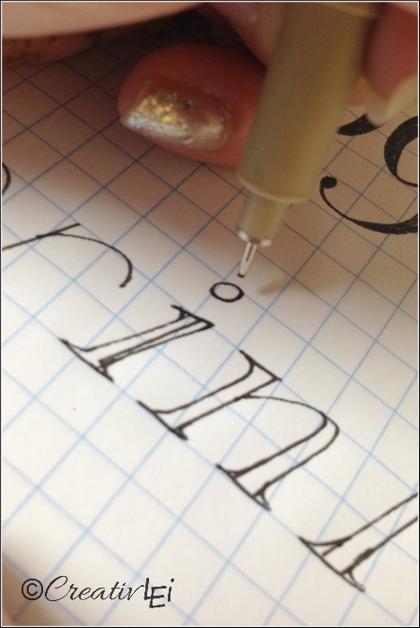
Use your favorite pen to outline your word. I’m using black so that you can easily see the details, but feel free to work in whichever color you like.
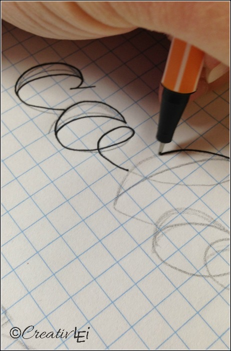
Then go back and erase your pencil sketch lines. I used a kneaded eraser.
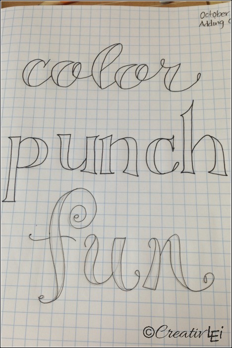
Choose your color tool. For this sample page I used colored pencils.
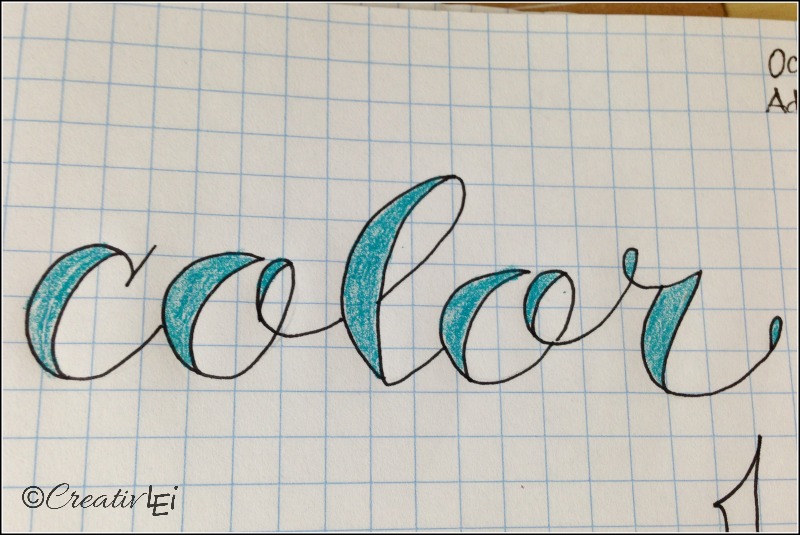
In the first word I used a Prismacolor pencil and colored evenly in the outlined word.
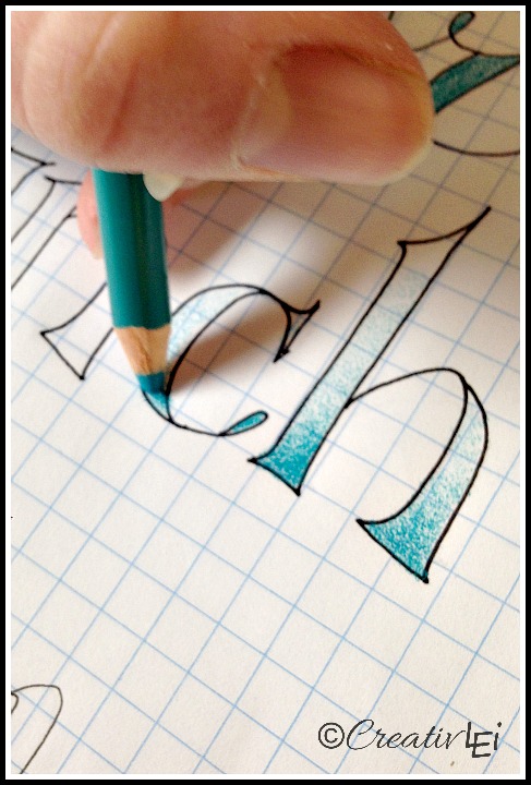
In the second word I colored heavily at the base of each letter and got progressively lighter on the way up for an ombré look.
On the final word I used two contrasting colors. I started by laying a very light base of each color. For ‘fun’ I used Crayola colored pencils.
One color from the bottom, up.
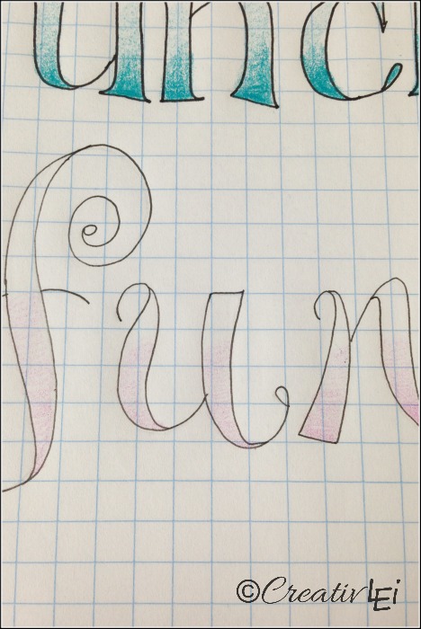
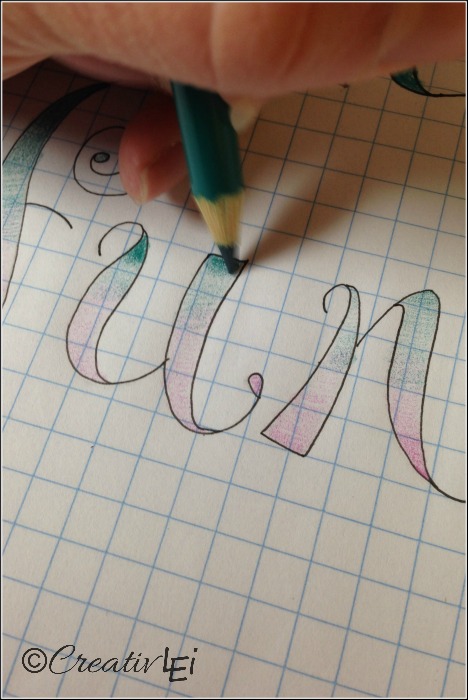
The other from the top, down.
Allowing them to overlap a bit and mix (very lightly).
Then I went back and darkened the very top and bottom.
I also added gray shading to add dimension.
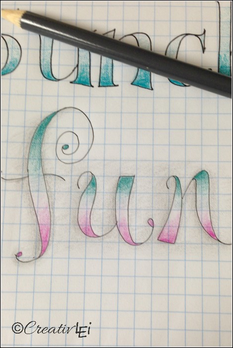
Here’s my finished sample for today:
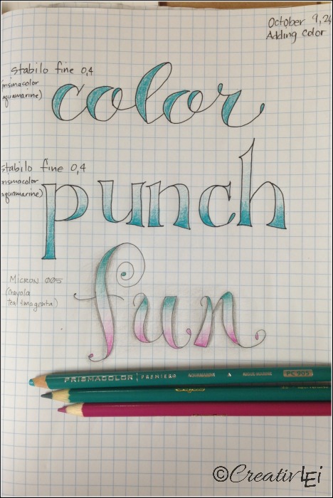
Video demonstration of adding color into faux calligraphy:

**If you’re just joining us and would like to look at the suggested supplies, they can be found in this post: Do You Want to Learn Hand-Lettering But feel free to jump in with whatever tools you have handy.**
