The truth is, I know you were only working through the drills to get to the good stuff. You want to be able to write out pretty hand-lettered quotes but maybe you’re not confident at combining styles in hand lettering. Fear not! We’ve got this.

Real tips for combining styles in hand lettering so it doesn’t look like a hot mess.
Maybe that made you laugh but isn’t that what holds you back when lettering? Part of moving forward is getting rid of the notion that what you create is not going to look ‘right.’ Do you need to let go of the expectations your mind’s eye sets for your design that you can’t quite translate with the pen?
Disclosure: Many of the links used on this site are affiliate and referral links. If you click on and purchase through these links I may make a small commission (sometimes it’s literally pennies, but whatevs). That commission is at no extra expense to you, which is pretty awesome. I value your trust and only link to products I use, love, or am saving up my birthday money to buy. You can read my full disclosure statement for more information. Feel free to ask any question you have regarding these links.)
Perfectionism will hold you back in your lettering journey.
I get it, I really do. We have this picture in our mind of the beautiful piece we’re going to create, then we put it on the paper and… nope! Not what we imagined.
My biggest step in growth in my own calligraphy and hand lettering journey was letting go of that expectation of perfection and embracing the nuances of my unique handwriting. That is exactly why this series started, not to give you exemplar upon exemplar to trace and emulate, but to give you techniques to apply to your natural hand to improve and develop into something you are proud to share.
Start with a quote or verse that you enjoy.
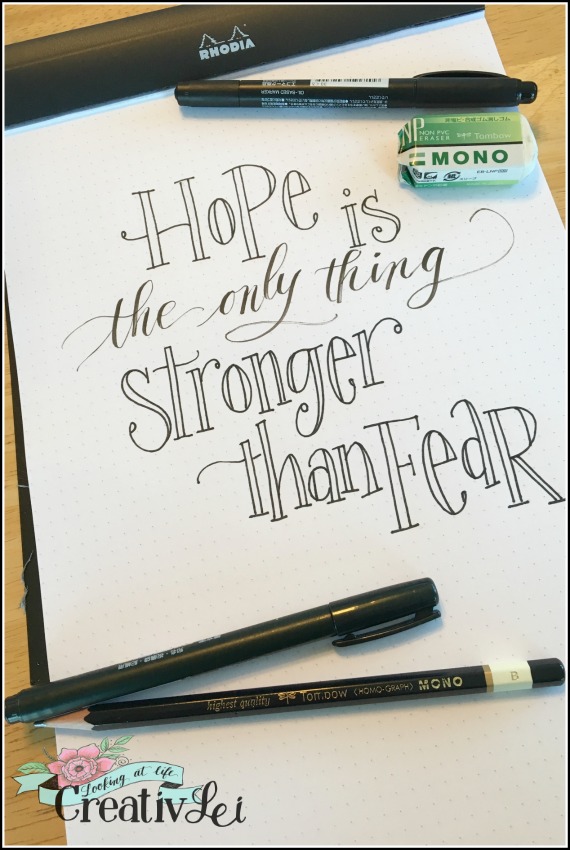
I worked on two different pieces. The first is a quote from the Hunger Games that I find affirming. In this piece I’m combining only two lettering styles, a serif print and a brush script. For me, the emphasis of this quote is hope as a contrast of fear, so I’m writing that portion of the phrase in bold print. The qualifying line “the only thing” is in the script to tie it together without grabbing too much attention.

Limit the number of styles you combine.
We can get excited about using all of the different styles we’re learning, but when we combine too many styles our finished piece can look confusing.
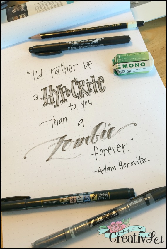
My second piece (a quote from the notes in the Beastie Boys anthology) uses three lettering styles, which tends to be my limit. I used a sans-serif print, serif print, and modern brush script. While they’re technically two different styles, my serif and sans-serif prints are actually the same style with the addition of the feet to ‘hypocrite’ to make it stand out.

‘Zombie’ is a modern brush script created with a worn-in brush pen for textural effect. I also used drop shadows in gray on both of my emphasized words.
The trick to combining styles is not causing them to compete with one another, but compliment each other. I wouldn’t use two different script styles, because they would not flow well together. I will often blend print with brush lettering and choose emphasis words to make my message stand out. When I combine serif and sans-serif styles, I will make one very bold for focus and the other very simple for clarity.
How you combine styles can help you infer the message you’re making with the quotes you chose.
Don’t be afraid to try a few different samples. Do you have a verse that is important to you? Song lyrics you love? A quote from a favorite book? Try your hand at a few different pieces using different styles.
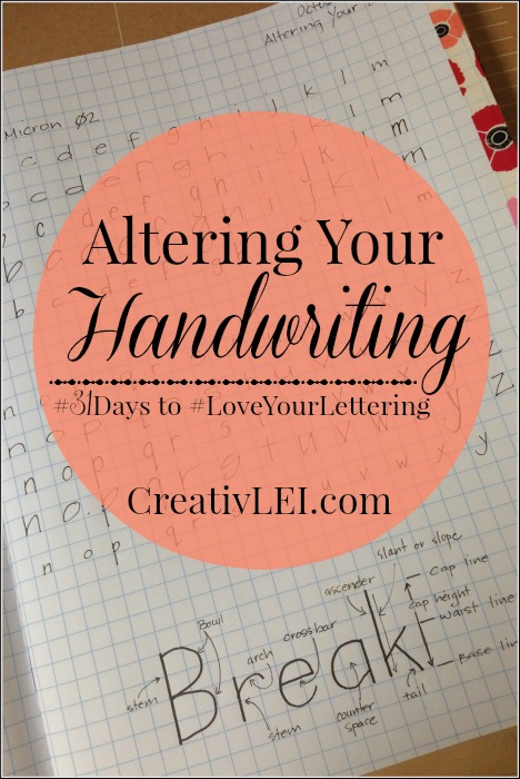
If you need a little more held with altering your lettering styles, take a look at this post from #loveYOURlettering: Part 1:
Supplies used in this lesson:


Leave a Reply