On day 2 we wrote samples of our natural handwriting, then we stepped back to look at which shapes form each letter. Now, it’s time to combine those two exercises to refine our handwriting.
Let’s analyze our handwriting.
*video updated, 2017*
With a pencil we’re going to go back to our handwriting sample page and look for places where our letter forms get diminished. Circle the spots where individual letters start to lose their unique identity.
In order to comfortably push the limits of natural handwriting into creative lettering, we’ll want to have full confidence in our writing.
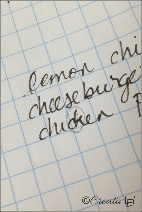
We’re not writing shorthand, we need to make sure we’re completing the whole letter. I noticed that sometimes when I’m writing fast, my ‘e’ can start to look like an ‘o’.
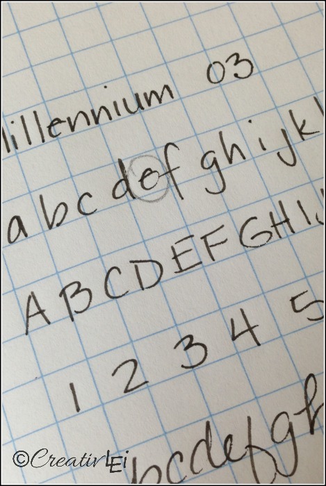
Do you mix print and cursive? I often do, but I noticed that when I combine the two styles, some of the letter joins start to resemble a different letter all together! This ‘ou’ combination actually starts to look like my cursive ‘r’.
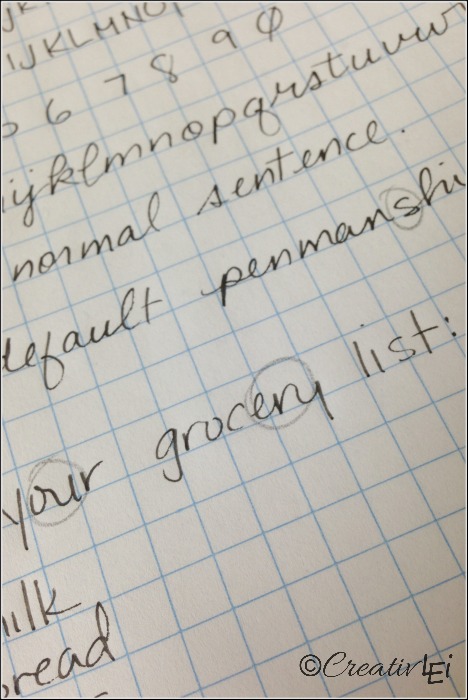
The way I’ve connected this ‘r’ and ‘y’ looks like an ‘n’!
Other times my haste smooshes (yes, a very technical term) letters and leaves no ‘breathing’ room.
Now, let’s write another page of samples, this time taking our time and paying attention to the full form of each letter. Try to place one letter in each square (one of the reasons I love graph paper). Allow the miniscules (lower case) to fill the whole box, and let the ascenders (the b, d, f, h, k, l, t) and descenders (g, j, q, y) rise or dip from that box.
Don’t worry, we’ll get back to personal style and flair, but for today we’re looking at properly formed letters.
Yes, this will bring you back to penmanship practice from grade school.
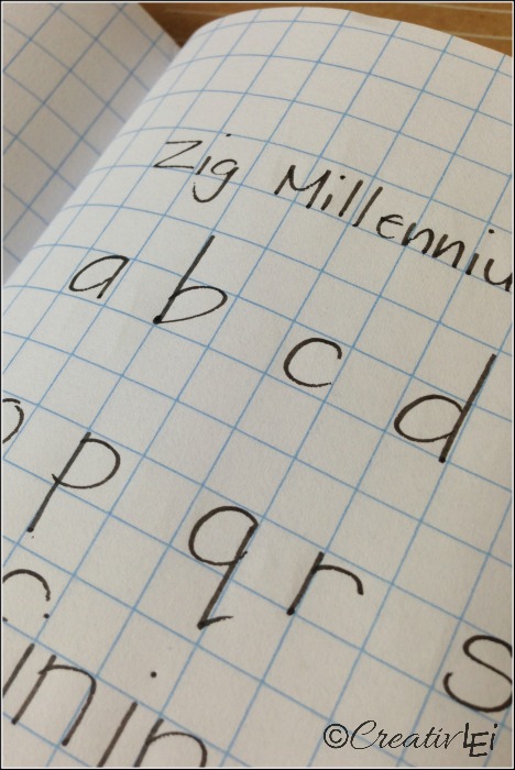
Use the grid as guidelines for your ascenders and descenders.
I’m focusing on the miniscule letters, since those are the ones we have a greater tendency to allow them to run into each other and lose their form.
I also wrote a couple of sentences, taking time to give each letter its own space. I also added a bit of encouragement.
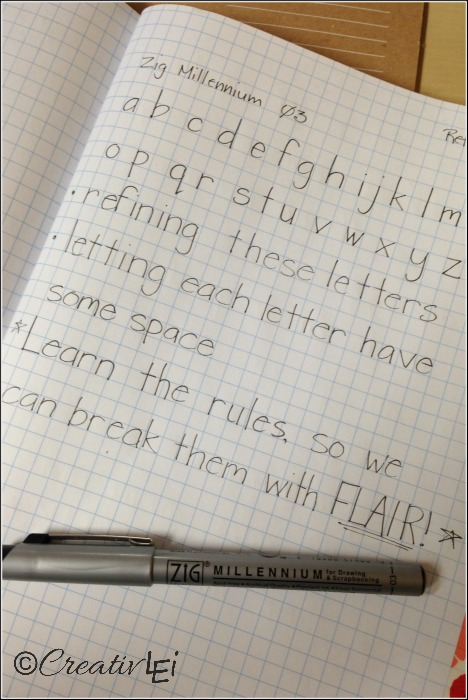
We need to learn the rules, so we can break them with FLAIR!
To practice cursive, I’m writing two of each letter so that I can watch how I connect the letters.
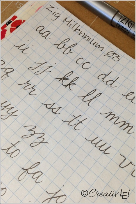
Then I also practiced a few different pairs of letters, since they join differently depending on the letters.
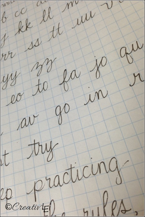
Then jot a couple of sentences.
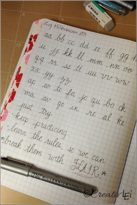
Did you notice what I did? We’ll talk about combining styles and whimsy later in the month, but can you see how FLAIR in all printed capital letters looked great and added punch, but in all cursive capitals, not so great? It looks jumbled and clumsy.
This is why we learn rules… to break them well!
Practice these on a couple of pages if you find this helpful. Tomorrow we’ll be switching it up and bending these rules. Make sure to repeat the letters and combos that you found to be struggle spots from your original sample page.
Watch the video demonstration of how I write out the print and cursive alphabets:
How are you doing so far? Do you need more help with any of these?
Looking for printable guide sheets?
There is now a companion guide available for this portion of Love Your Lettering, if you feel more comfortable working through a printable guide:

I failed to get an email again today. I came directly to your website and am only mentioning it because the mass email might not have gone out again to all the others that are following you, as well. 😁
Just received the email at 11:01…I was just too excited to wait! Sorry!
Thanks, I’m working on ironing out the kinks. I’m pretty new at the email service. Thanks for your patience.
Hi Lisa, Thank you for doing this. Do have a sample of what the letters should look like in cursive. Upper and lower? I seem to have forgotten what some of them should look like.
Thanks
I didn’t create a sheet, but have included the lower case in my sample page. We’ll talk more about inspiration sources this coming weekend.
Just got yesterdays email at 12:01 and have not recieved todays at all yet.
Loving this already! Thank you!
Practice, practice, practice! Just for clarification, in print and script, is each letter supposed to be in each square? In script, I keep going from 1 square to half a square back to one square… if you follow me.
Catch you later.
I found that with cursive, you do tend to bounce between a square and half a square because of how we connect letters. We just needed to practice on good, clear, full letters so that we can have fun with them in the coming days.
I am very late getting into this series. (I still haven’t bought my grid paper) But I’ve been looking at and going back to your emails as I receive them, and I have decided that when I buy my notebook, I will buy an extra one for my son. He is in 2nd grade and while his handwriting is quite neat, he is slow when he writes. I am hoping that he will practice along with me and we can improve our handwriting together and I think he will love being able to use “flair” when he draws and labels his drawings.
Messages like this are a true encouragement to me. I love that something like this series could be used to not only stretch your creativity, but for your little one to learn and have fun!
I was wondering if there was a way that I could purchase a copy of your periscope videos on the 31 Days of Creative Lettering…..we live in very rural area and unfortunately can only get hughesnet for our internet, which has daily usage limit caps…so very hard for us to watch the videos.
Hi Nora, right now I don’t have the ability to create that, but it is something I can research for the future. Thanks for the great idea. Would shorter instructive videos with less chat be helpful?
I would hate for you to shorten the videos…we love the chatting, etc. We will, for now that is, try to watch the videos at free wifi centers.
I am having a really, really hard time with the spacing of the word “practicing.” The “ti” totally knock off the balance of the word. I really fill the square with the letter and I’m trying to not be so generous with my size.
Kate, are you on Periscope? I’d love to hop on there for a quick(-ish) demonstration to help answer your questions.
Doing these now for the run-up to this years October run – but I am sooooo much struggling with the lower case r in cursive.. We learned it different in school and as pretty as I am finding it, I just cannot get my head around it.. especially not coming right after b as in “break” -.- my hand just doesnt want to do it -.- so sad
Thanks for the input, Meike. I know you’re not the only one that struggles with those transitions. I’ll be sure to address that in the first week of the series, while review the basics.
Hi Lisa. I’m working through this series now for the first time here in January 2017. I used to hate my handwriting, partly because my sister has beautiful writing. But lately I have started to like it more. It’s not great, and I get in a rush and I think no one would be able to read it. (I’ve had notes at work that even I have had trouble decidering days later. 🙂 ) Anyway, I’m loving this series so far and it is helping me slow down and pay attention to how I write. A few things on this particular lesson… over the years I’ve lost the extra humps on the cursive m and n. I don’t know if thats a consequence of rushing or if I thought that looked better way back when. But today, I like them written appropriately. Then my bigger problem is that I really don’t know how to appropriately write many capital letters in cursive. I haven’t watched the video yet so I’m hoping you address that or maybe in a later lesson.
Thanks so much for doing this!
Thank you for your feedback, Angela. I’m working on exemplars and guides for each of the alphabets I shared. It’s just taking me much longer than I expected, to develop them.