We’re getting back on track today in our #LoveYourLettering series after a little hiatus while I was out of town at the amazing 2:1 Conference this past weekend.

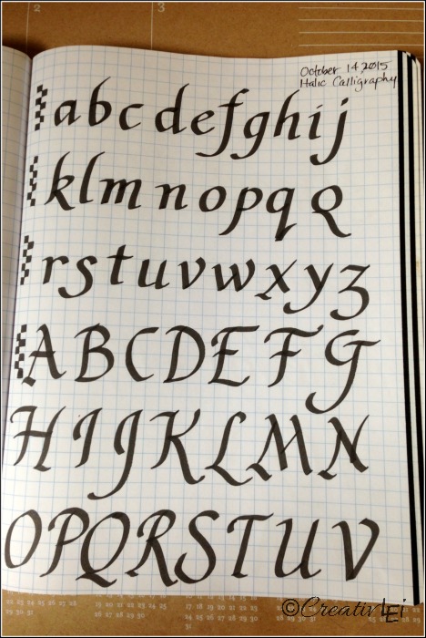
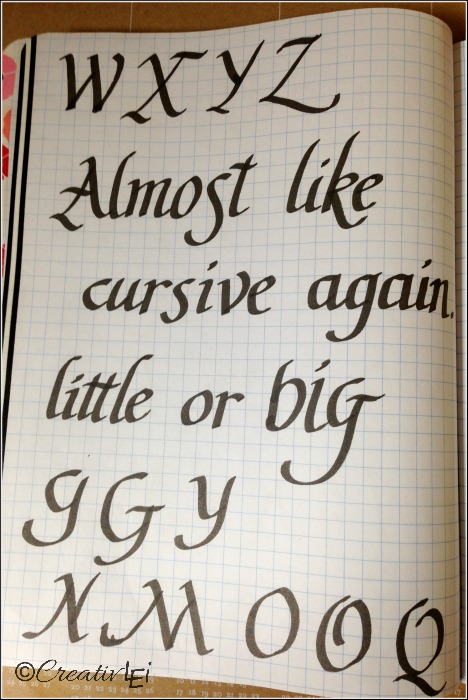
Learning how to use a broad nib pen for italic calligraphy.
Just like we practiced our print handwriting and cursive, while using a fine point pen, now we’ll do similarly with a calligraphy pen.
(We participate in affiliate marketing and some links in this post may be affiliate links. The full disclosure statement can be read here.)
If you would like to download and print a slanted grid paper to practice, there are a few available on PrintablePaper.com. (I prefer the slant of the ‘script’ options.) You can also find pads of calligraphy paper for purchase.
You can use the checkerboard to help set the size you’ll work on, if you’re not using calligraphy paper. I worked my samples in my grid notebook. (You could even trace the slanted guidelines of the printable paper and then slip that between the taped together sheets as a shadow guide.)
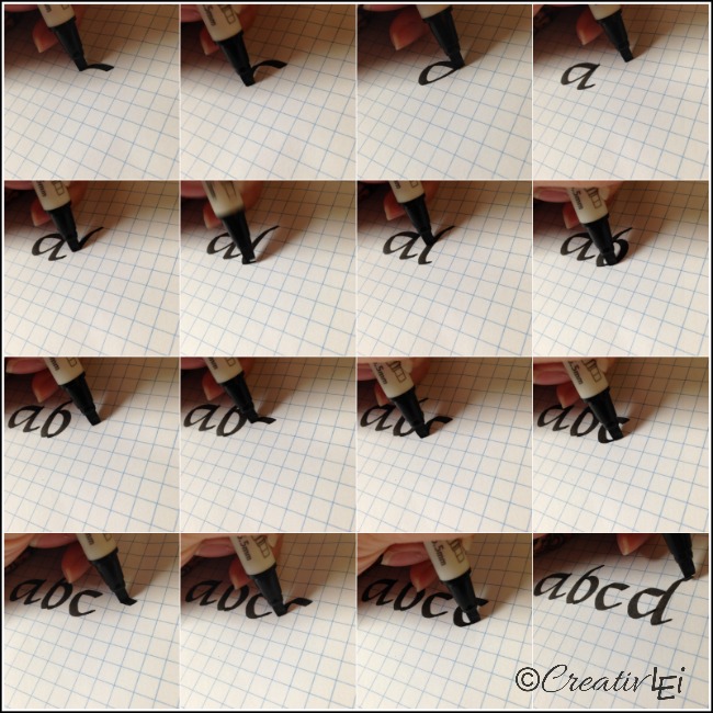
The difference between printing and this italic style, is the slant. You are still going to keep the nib (tip) of that pen at the same angle for the entire letter.
Be sure to leave enough space between lines for ascending letters and descending letters to avoid crossing each other in a way that would cause two broad lines to overlap.
Once you feel comfortable with the basic flow of each letter, try writing a few words. This will allow you to work on letter joins, if they’re appropriate. Some tails want to connect. Don’t add a tail where it wouldn’t come naturally.
What is the best size nib to get for the Parallel pen?
Hi Anne. I tend to use the 2.4mm and 3.8 the most. I like the 1.5, but it is a bit narrow.
I love my new fountain pen!!! Never, ever thought I’d use one, and here I am! My hubs wanted me to address an envelope…of course I had to get out my fountain pen and do it up right! 😀
That’s so awesome. Thanks for sharing your success!
This angle feels much more natural for me.
I had purchased a 2.0 calligraphy pen, but it’s too small, can’t see the thick and thin well enough. Switched to a 3.0 and love it!
Yes, the 2.0 is a little narrow to see the difference. Hopefully the 3.0 will make a good difference for you.
Hi! I hope you can help me. I’m a bit confused. So, when you use the slanted paper do you still hold the pen at a 45 degree angle? What do you do different then on regular grid paper? I’m just lost as to how to hold my pen differently between those two papers. Thanks so much!
Hi Wendy, I’m sorry I missed this earlier. The calligraphy pen tip needs to stay at an angle regardless of the slant on the guidelines. It is the angle of the pen that creates the thick and thin lines.
I just want to say thank you so much for sharing your priceless talent and skills with us. It has been so therapeutic and I look forward to it every 5am breakfast (me time)! Also, it is so nice to watch your scopes. You seem like such a humble, welcoming person and the way you speak and address questions is so pleasant and sweet. Thank you SO much and God bless you and your lovely family. <3
Sandra, thank you so much for your compliments and encouragement. I am so enjoying this series with you all.