Now we’re getting into the real fun you all have been waiting for. We’re taking what we learned about proper penmanship and launching into stylized and creative lettering.
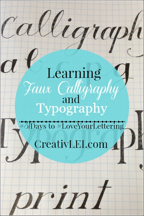
Creating faux calligraphy from your own handwriting.
This post will have a lot of photos since I hope to capture the different steps of this technique. On our Periscope chat tonight we’ll review this process further.
Choose your favorite pen or pencil to get started.
I began with cursive, since my natural hand is usually more cursive than print. You can start with either one, the main technique is the same.
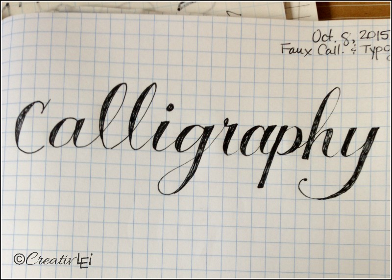
Draw out your word or alphabet with nice, even and open letters. I’m working big so that it will photograph clearly, feel free to work at a point size that is more comfortable for your hand.
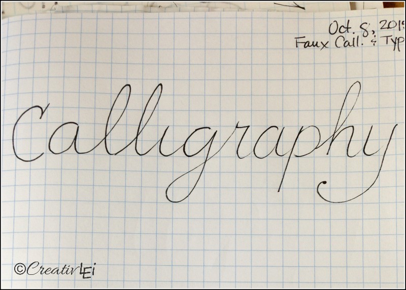
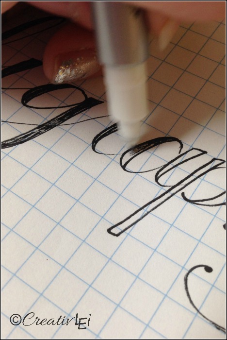
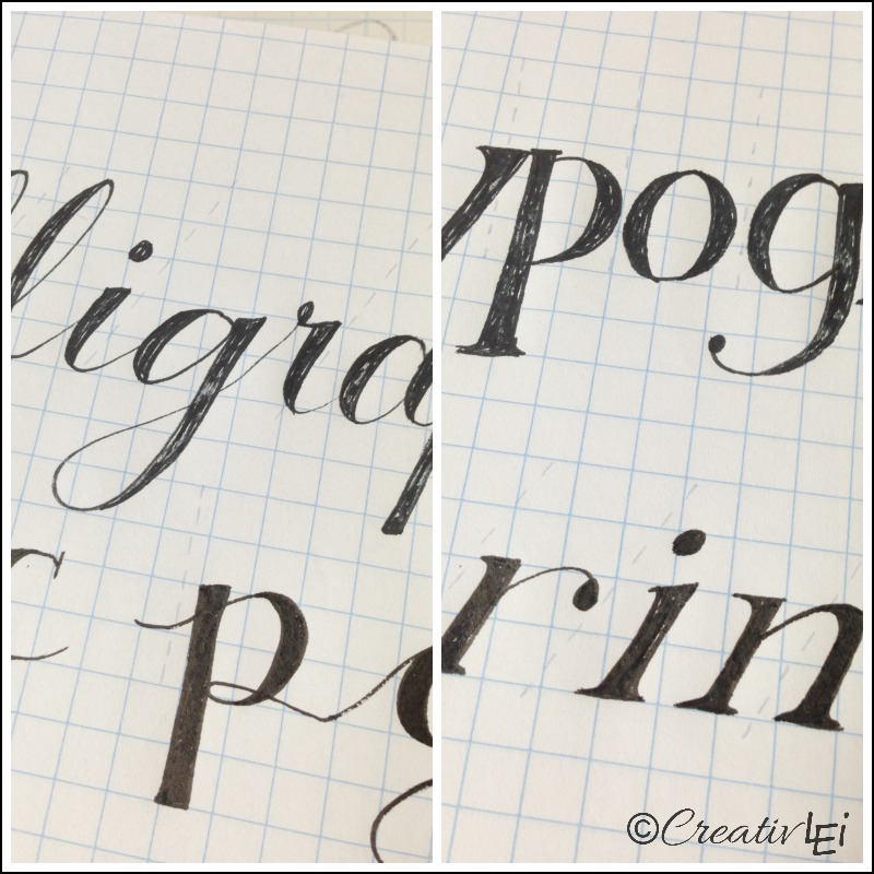
After your word is written, go back and add a second line to your vertical lines. This adds weight to the down strokes. You’ll leave the up strokes as hairlines.
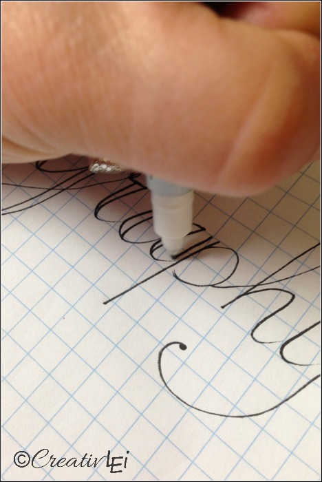
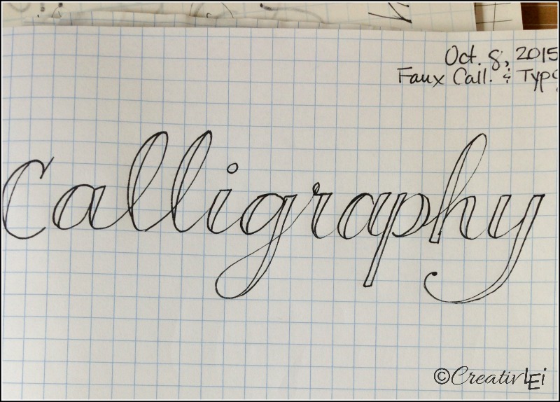
Sometimes it takes me a couple passes to get the width I’m after, don’t worry if you need to do the same.
Then go back and fill in that weighted line.
Sounds easy, right? Hang with me…
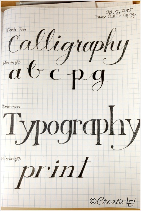
Once you’ve done this technique a number of times, it does get much easier. I practice this method a lot on my scribble pads. This is the notepad I used when updating the design of my blog. I had to doodle out the look I was thinking of before I could form it digitally, using this faux calligraphy technique.
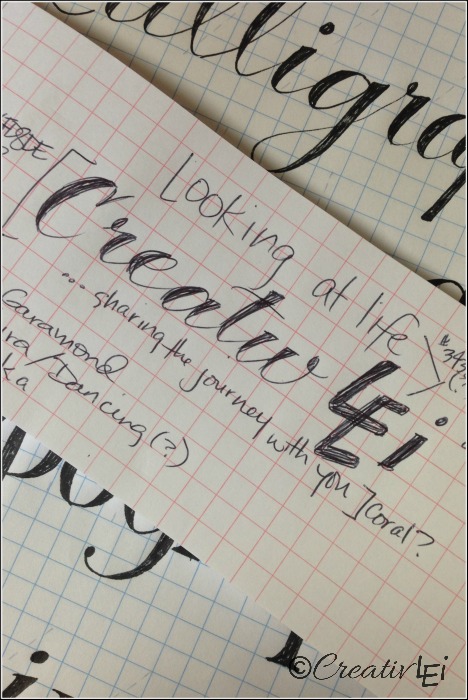
You can use this technique for print-style typography. Draw out your word (or practice letters).
Then go back and add a second line to weight the vertical strokes.
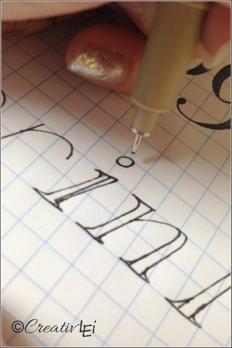
I usually add feet (serifs) to the print letters, but you could leave them off.
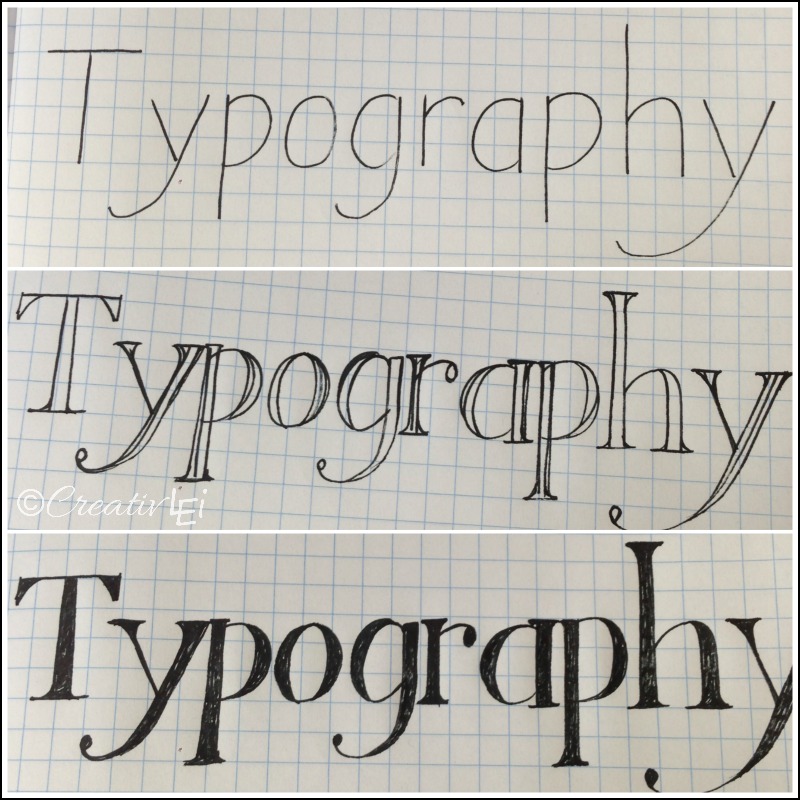
The look and style will vary depending on your handwriting. If you have more of a natural slant(slope) the overall look will change, but the technique is the same.
Have you tried this technique before?
You’ll be looking for ways to use this often, it’s a really fun technique that opens up possibilities for lots of fun creative lettering.
Here’s a video demonstration of the faux calligraphy technique:

**I’ve gotten some questions regarding paper for practicing. I usually stick with graph paper, quad ruled, or a dot grid, but for those who would like to work on the slant of your writing, these are some practice pads to check out for consideration(these are affiliate links, if you’d like to read my full disclosure statement you can find it here):


Oh My Lisa!! I’m glad you’re going to Scope about this tonight! I think it will be much easier for us to comprehend seeing you do it in person 😉
It’s so beautiful! @doodlezanddesignz
Definitely. Some things are much easier to show through video than still shots! See you tonight. 🙂
Will you post it here or email us a link to the periscope video so we can watch it after? … Thanks for sharing your talents with us all 😀
Hi Cynthia, I post the Periscope videos into the corresponding posts after the live broadcast. Thanks for asking.
I don’t see the Periscope link. Am I missing something ?
It should be up now. 😉
That was a great tip that you don’t want two weighted lines to cross (from the Scope). Thank you for clarifying that – that helps make it easier to figure out what lines to weight and what not to weight. 🙂
How can I find your lettering board on pinterest???
They’ll be on tomorrow’s post. I’m finishing it now. 😉
I used to do calligraphy and so I get the thin/thicks however, when I try and do this with a micron or staedtler I can’t get my lines even. What I mean is that I end up not being able to finish my thick evenly and there are stray lines sticking out… like my coloring goes outside the lines. Is that just practice? It’s so messy and looks so bad I can’t use it for anything. If I go back and smooth the lines I mess up the thick/thins. Ideas? It’s very, very frustrating! I’ve started with a 0.5 and tried making the thins with a .05 thinking it would give me more control. nope. Started with a 0.1 and used a 0.8 to make the thick. nope. I’m just incapable of keeping a smooth line without my actual calligraphy ink pen. But that limits me greatly. (especially because I have no ink at the moment) Is there a “trick” to smoothing where the thick and thin meet? thanks!
I started your classes yesterday. It sure has been fun. I can really see now that correcting your penmanship helps with this current lesson.
You have done such a good job. Your a great lady to listen too. Very fun.
Thank you and welcome. If I can be of any help answering questions that come up, I’m always happy to help.
Do you have a resource where I can see all of the alphabet done with this technique? It would help with knowing where the weight is supposed to be. 🙂
Hi Kristin, I have not yet published my guide sheets, there’s an ebook coming this spring. However, if you are subscribed to my newsletter, you’ll be receiving a sneak peek guide sheet of my faux calligraphy and faux typography alphabets. 😉 That will hit inboxes this weekend.
So I’m kind of on day 8-9-10. I don’t have colored pencils on me so I’ve just repeated day 8 again. Until I totally distracted myself. I couldn’t come up with any pretty words to write so I started brainstorming a list. Some I like the sound. Some I like the letter combinations. Some I like because they are my favorite things. If you are stuck for words maybe this will unstick you too! Luminescence, solitude, aurora, eloquence, pluviophile, nuance, resilient, sequoia, euphoria, prosper, decadent, epiphany, iridescent, serendipity, ripple, epoch, lilt, lithe, felicity, dalliance, shenanigan, fidelity, magnificent, perhaps, wonderlust, righteous, nostalgic, melancholy, clarity, aspiration, surrender, panacea, silhouette, sanctuary, serenity, coquettish, waterlily. Now add your favorite color, flower, food, season, month, animal, significant other’s name, child’s name, etc. Think daisy, purple, cat, chocolate, summer, etc.